For this project, I want to investigate the unfortunate tragedy of the sinking of the Titanic. The movie “Titanic”- which I watched when I was still a child left a strong memory for me. The event occurred in the early morning of 15 April 1912, when the ship collided with an iceberg, and out of 2,224 passengers, more than 1500 died.
The dataset I am working with contains the demographic information, and other information including ticket class, cabin number, fare price of 891 passengers. The main question I am curious about: What are the factors that correlate with the survival outcome of passengers?
Load the dataset
First of all, I want to get an overview of the data and identify whether there is additional data cleaning/wrangling to be done before diving deeper. I start off by reading the CSV file into a Pandas Dataframe.
#load the libraries that I might need to use
%matplotlib inline
import pandas as pd
import numpy as np
import csv
import matplotlib
import matplotlib.pyplot as plt
import seaborn as sns
#read the csv file into a pandas dataframe
titanic_original = pd.DataFrame.from_csv('titanic-data.csv', index_col=None)
titanic_original
Data Dictionary
Variables Definitions
- survival (Survival 0 = No, 1 = Yes)
- pclass (Ticket class 1 = 1st, 2 = 2nd, 3 = 3rd)
- sex (Sex)
- Age (Age in years)
- sibsp (# of siblings / spouses aboard the Titanic)
- parch (# of parents / children aboard the Titanic)
- ticket (Ticket number)
- fare (Passenger fare price)
- cabin (Cabin number)
- embarked (Port of Embarkation C = Cherbourg, Q = Queenstown, S = Southampton)
Note:
- pclass: A proxy for socio-economic status (SES) - 1st = Upper, 2nd = Middle, 3rd = Lower
- age: Age is fractional if less than 1.
- sibsp: Sibling = brother, sister, stepbrother, stepsister; Spouse = husband, wife
- parch: Parent = mother, father; Child = daughter, son, stepdaughter, stepson
Data Cleaning
I want to check if there is duplicated data. By using the unique(), I checked the passenger ID to see there is duplicated entries.
#check if there is duplicated data by checking passenger ID.
len(titanic_original['PassengerId'].unique())891Looks like there are no duplicated entries based on passengers ID. We have in total 891 passengers in the dataset. However I have noticed there is a lot of missing values in ‘Cabin’ feature, and the ‘Ticket’ feature does not provide useful information for my analysis. I decided to remove them from the dataset by using drop() function.
There are also some missing values in the ‘Age’, I can either removed them or replace them with the mean. Considering there is still a good sample size (>700 entries) after removal, I decide to remove the missing values with dropNa().
#make a copy of dataset
titanic_cleaned=titanic_original.copy()
#remove ticket and cabin feature from dataset
titanic_cleaned=titanic_cleaned.drop(['Ticket','Cabin'], axis=1)
#Remove missing values.
titanic_cleaned=titanic_cleaned.dropna()
#Check to see if the cleaning is successful
titanic_cleaned.head()
# Create Survival Label Column
titanic_cleaned['Survival'] = titanic_cleaned.Survived.map({0 : 'Died', 1 : 'Survived'})
# Create Class Label Column
titanic_cleaned['Class'] = titanic_cleaned.Pclass.map({1 : 'Upper Class', 2 : 'Middle Class', 3 : 'Lower Class'})Data overview
Now with a clean dataset, I am ready to formulate my hypothesis. I want to get a general overview of statistics for the dataset first. The useful statistic to look at is the mean, which gives us a general idea what the average value is for each feature. The standard deviation provides information on the spread of the data.
Looking at the means and medians, we see that the biggest difference is between mean and median of fare price. The mean is 34.57 while the median is only 15.65. It is likely due to the presence of outliers, the wealthy individuals who could afford the best suits.
sns.set(style="darkgrid")
ax = sns.countplot(x="Survival", data=titanic_cleaned)
plt.title("Distribution of Survival")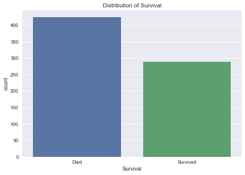
We see that there were 342 passengers survived the disaster or around 38% of the sample.
fig = plt.figure(figsize=(10,5))
ax1 = fig.add_subplot(121)
ax1=sns.countplot(x="Sex", data=titanic_cleaned)
plt.title("Distribution of Gender")

fig.add_subplot(122)
ax2 = sns.countplot(x="Class", data=titanic_cleaned)
plt.title('Distribution of Class')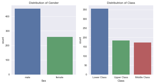
It is now a good idea to combine the two graph to see how gender and socioeconomic class are intertwined. We see that among men, there is a much higher number of lower socioeconomic class individuals compared to women.
sns.countplot(x='Sex', hue='Class', data=titanic_cleaned)
plt.title('Gender and Socioeconomic class')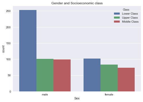
fig = plt.figure(figsize=(10,5))
ax1 = fig.add_subplot(121)
sns.distplot(titanic_cleaned.Fare)
plt.title('Distribution of fare price')

axe2=fig.add_subplot(122)
sns.distplot(titanic_cleaned.Age,bins=40,hist=True, kde=False)
plt.title('Distribution of age')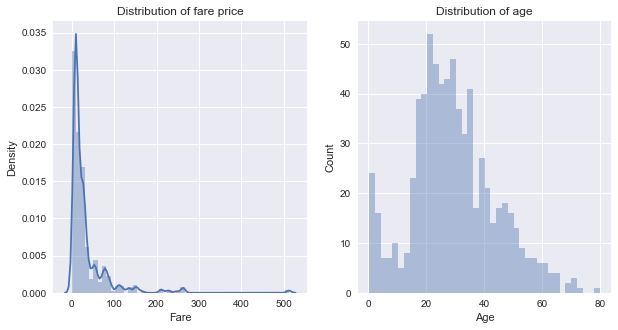
We can see that the shape of two plots is quite different.
- The fare price distribution plot shows a positively skewed curve, as most of the prices are concentrated below 30 dollars
- The age distribution plot demonstrates more of a bell-shaped curve (Gaussian distribution) with a slight mode for infants and young children
Observations on the dataset
- 342 passengers or roughly 38% of total survived.
- There were significantly more men than women on board.
- There are significantly higher numbers of lower class passengers compared to the mid and upper class.
- The majority of fares sold are below 30 dollars, however, the upper price range of fare is very high.
Hypothesis
Based on the overview of the data, I formulated 3 potential features that may have influenced the survival.
- Fare price: What is the effect of fare price on survival rate?
- Gender: Does gender play a role in survival?
- Age: What age groups of the passengers are more likely to survive?
Fare Price and survival
sns.boxplot(x="Class", y="Fare", data=titanic_cleaned)
sns.stripplot(x="Class", y="Fare", data=titanic_cleaned, color=".25")
plt.title('Class and fare price')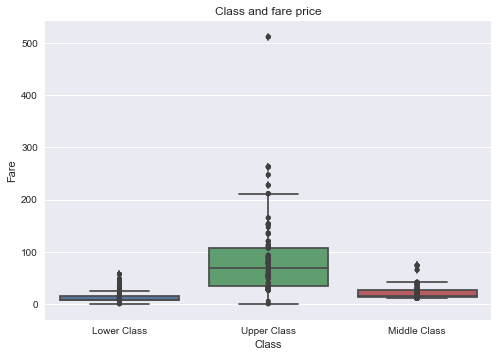
The outliers existed exclusively in the high socioeconomic class group. I break down the fare data into two groups: passengers with fare <=35 dollars and passengers with fare >35 dollars.
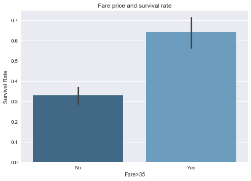
The survival rate for the high fare group is 64% vs 33% for the low fare group.
sns.barplot(x='Fare>35',y='Survived',data=titanic_fare, palette="Blues_d")
plt.title('Fare price and survival rate')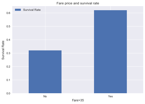
Using logistic regression with fare price as an estimator for survival:
sns.lmplot(x="Fare", y="Survived", data=titanic_fare, logistic=True, y_jitter=.03)
plt.title('Logistic regression using fare price as estimator for survival outcome')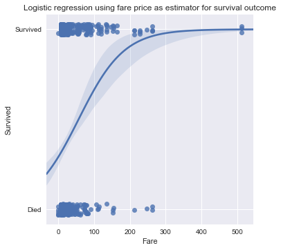
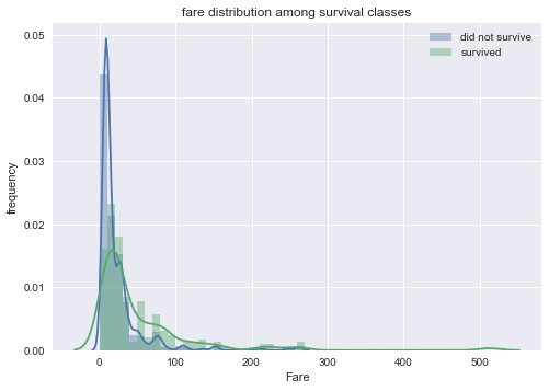
The fare distribution between survivors and non-survivors shows that there is a peak in mortality for low fare price.
Gender and Survival
Being a female is associated with significantly higher survival rate compared to male.
In addition, being in the higher socioeconomic group and higher fare group are associated with a higher survival rate in both male and female.
The difference is that in the male the survival rates are similar for class 2 and 3 with class 1 being much higher, while in the female the survival rates are similar for class 1 and 2 with class 3 being much lower.
Age and Survival
Age groups:
- newborn to 10 years old
- 10 to 20 years old
- 20 to 30 years old
- 30 to 40 years old
- 40 to 50 years old
- over 50 years old
The bar graphs demonstrate that only age group 1 (infants/young children) is associated with significantly higher survival rate. There are no clear distinctions on survival rate between the rest of age groups.
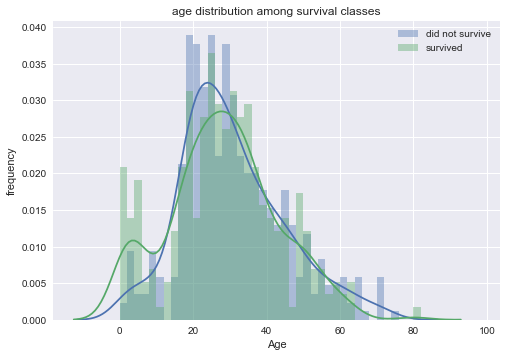
The age distribution comparison between survivors and non-survivors confirmed the survival spike in young children.
Limitations
-
Missing values: due to too much missing values (688) for the cabin, I decided to remove this column. The 178 missing values for age posed problems — I decided to drop them since we still had >700 entries.
-
Survival bias: the data was partially collected from survivors, and there could be a lot of data missing for people who did not survive.
-
Outliers: fare prices had a large difference between mean (34.57) and median (15.65). The highest fares were well over 500 dollars, creating a positively skewed distribution.
Conclusion
The dataset on Titanic’s 891 passengers provided valuable insights. Through data analysis and visualizations, we saw that factors such as being in a higher socioeconomic class, higher fare price, being a female, being a young child/infant were all associated with significantly higher survival rate.
However, the missing values, survivor bias, and outliers introduced bias and affected the validity and accuracy of our study. For future studies, incorporating several datasets of similar disasters may allow us to make predictions on disaster survival outcomes.
References
“RMS Titanic”, 2017, Wikipedia, from https://en.wikipedia.org/wiki/RMS_Titanic
“Titanic: Machine Learning from Disaster”, 2017, Kaggle, from https://www.kaggle.com/c/titanic